The Washington Post
Reimagining Digital Subscriptions
The Problem
The Washington Post faces declining subscription numbers, particularly among young and Gen Z users, with current subscription plans perceived as unattractive, confusing, and lacking clear value proposition.
The Solution
A redesigned subscription experience featuring clear tier structures, transparent pricing, comprehensive feature lists, and value-driven messaging to convert younger audiences into paying subscribers.
Impact & Results
Role
UX Designer
Focus
Subscription Experience
Methods
User Research, Competitive Analysis, Wireframing
Scope
Research, Journey Mapping, Wireframing, User Testing
Timeline
3-Week Sprint
Key Research Insights
Younger Audience Gap
The Washington Post struggles with low engagement and subscription rates among young and Gen Z users, despite strong social media presence on Instagram, TikTok, and YouTube.
"Declining subscription numbers particularly among young users identified as a key challenge."
Design Response:
Redesign subscription plans to be more attractive to younger audiences
Unclear Value Proposition
Current subscription plans appear confusing with limited options, minimal feature descriptions, and pricing that doesn't justify the cost for younger users.
"Price sensitivity and lack of perceived value were the primary barriers to subscription."
Design Response:
Clear tier structure with comprehensive feature lists and transparent pricing
Subscription Flow Friction
User journey mapping revealed users go from happy to curious to frustrated to annoyed to confused when encountering the paywall, with too many steps to access content.
"Overwhelming search process and unattractive subscription options lead to user abandonment."
Design Response:
Streamlined subscription flow with clear value proposition at paywall
User Validation
I conducted interviews with 8 participants from the target demographic (18-35) to validate the design approach.
Price Is the Primary Barrier
All 8 participants indicated they would not subscribe in the next six months at current pricing, though they would consider with more reasonable prices.
0/8 would subscribe at current prices
Free Trial Interest Confirmed
All participants expressed interest in a free trial, with expectation of better pricing to continue. 2-3 had previously subscribed but cancelled before payment.
100% interested in free trial
Monthly Billing Preferred
Almost all participants preferred Digital Access with monthly billing for flexibility to cancel. This validated our focus on transparent, flexible pricing options.
Monthly billing preferred for flexibility
Mid-Fidelity Wireframes
Based on user research insights, I redesigned the subscription experience to address key pain points.
Before & After: Subscription Flow Redesign
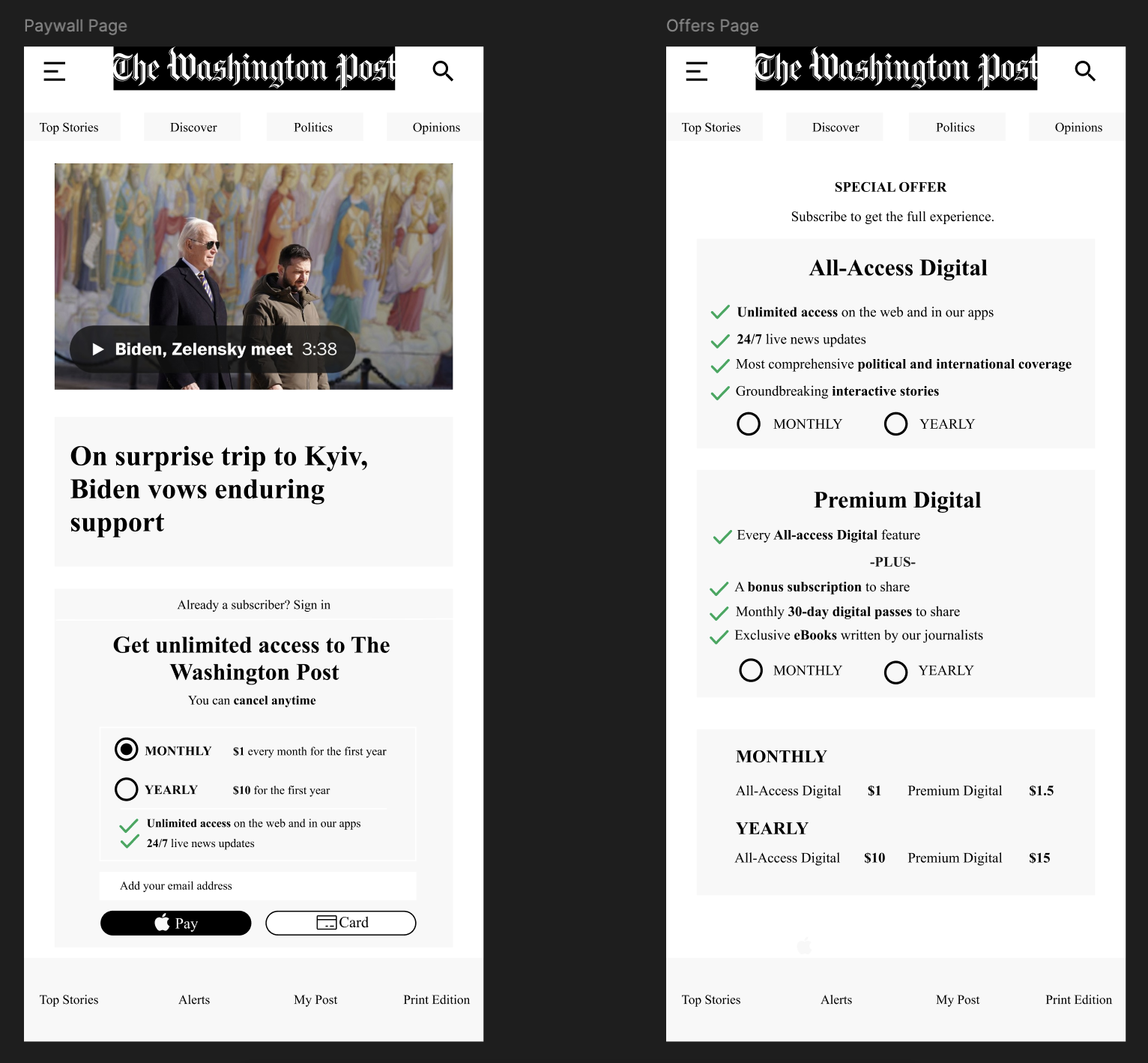
Left: Current paywall with limited information. Right: Redesigned offers page with clear value proposition.
Clear Value Proposition
Detailed feature lists help users understand what they're getting for their money
Structured Options
Two clear tiers make decision-making easier and reduce cognitive load
Transparent Pricing
Clear monthly and yearly pricing builds trust and reduces confusion