Candid Connections

It's Time to get Candid!

A professional networking platform designed specifically for designers, focusing on authentic connections, portfolio showcasing, and meaningful professional relationships without the noise of traditional platforms.

Candid Connections

Overview

Candid Connections is a professional networking site specially catered to Designers. My primary focus in this project is on the user profile view. Current networking sites are generic, complex, and full of advertising clutter. Enter Candid Connections, a simple, intuitive, easy to navigate application where designers can connect with each other.

Candid Connections features multiple profile views, each view presenting relevant information in a detailed and concise manner. The platform was built on extensive market research and iterative testing, resulting in a fresh and minimal look that makes it user-friendly.

Role

UX Designer

Focus

User Profile Design

Methods

User Research, Testing, Prototyping

Timeline

Spring 2022

Design Process

A comprehensive approach from research to final prototype, with multiple rounds of user testing and iteration.

Research

  • Competitors
  • Aesthetic Inspiration
  • Kickoff Meeting

Target Market

  • Empathy Mapping
  • User Personas & Journey

Sitemap

  • Final Sitemap

Initial Wireframes

  • Low-fidelity Wireframes
  • User Testing
  • Branding Testing

Mid-fidelity Wireframes

  • Mid-fidelity Wireframes
  • User Testing

Prototyping

  • Testing
  • Final Wireframes

Research & Discovery

I began with comprehensive research to understand the competitive landscape, user needs, and design opportunities.

Competitive Analysis

I analyzed existing professional networking platforms to identify gaps and opportunities for a designer-focused solution.

Li

LinkedIn

Pros
  • • Detailed profile view with comprehensive information
  • • Shows profile visitors and analytics
  • • Allows public profile editing
  • • Recent activity tracking
Cons
  • • Unnecessary cover photo takes up space
  • • Distracting sidebar advertisements
  • • Generic design doesn't serve creatives
X

Xing

Pros
  • • Simple and minimalistic design
  • • Less verbose, easier to read
  • • Visually appealing color palette
  • • Public profile editing capability
Cons
  • • Missing company/university logos
  • • Excessive white space in expanded fields
  • • Limited visual brand representation
A

AngelList

Pros
  • • Allows profile section reordering
  • • No ads or unrelated content
  • • Clean, focused interface
Cons
  • • Unnecessary cover photo
  • • Dull presentation with grey fonts
  • • Bland visual hierarchy

Aesthetic Inspiration

I researched visually appealing and interactive websites to inform the design direction.

Kati Forner

Artistic, visually appealing, and interactive with moving images. Features a minimalistic look with a welcome page that resembles a magazine cover.

katiforner.com

Parsons Branding

Features a unique cursor design and creative right/left scroll functionality. The website aesthetics are visually striking and innovative.

parsonsbranding.com

Kickoff Meeting Insights

I conducted stakeholder interviews to define the problem, business opportunity, and success metrics.

Key Problem

Helping designers showcase their profiles in a better way through a simple, visually appealing, well-organized platform.

Business Opportunity

A dedicated network for designers with potential for premium features and revenue streams once user base grows.

Success Metrics

  • • Profile views and time spent on profiles
  • • User satisfaction and retention rates
  • • Social media mentions and shares
  • • Session duration and engagement

User Research

I conducted extensive user research with 15 designers to understand their networking needs and pain points.

Research Methodology

Interview Questions

  • • How does it feel to be a Designer?
  • • How do you judge a website/app from a Designer's point of view?
  • • What professional networking sites do you use?
  • • How helpful is a professional networking site to you?
  • • How do you feel about a networking site just for Designers?
  • • How often do you visit your profile?
  • • Can you walk me through editing your profile?
  • • How do you manage your user profile?
  • • What should stand out in profile views?
  • • What features do you wish existed?
  • • What's the most helpful profile feature?
  • • What changes would you make to your profile?
  • • Does showcasing your portfolio help you?
  • • What comments have you received on your profile?

Research Participants (15 Designers)

Nupur Biswas
Akash Mantry
Mudit Somani
Monica Taparia
Ashmeet Rekhi
Maitri Chatterjee
Abhishek Sharma
Akshay Nagpal
Rahul Srivastava
Munish Taya
Kangan
Ishita Upadhyay
Gaurav Jha
Shatakshi Awasthi
Ashita Modi

User Personas

Based on interviews with 15 designers, I created three primary personas representing different user needs and goals.

R

Rachel

Interior Designer, 32, Miami

Recently promoted, Rachel needs to build her team while managing demanding travel schedules. She explores profiles on weekends between visiting art fairs.

Needs

  • • Showcase work/portfolio in profile
  • • User-friendly and simple interface
  • • Concise, to-the-point information

Frustrations

  • • No way to show actual work
  • • Slow loading pages
  • • Distracting advertisements
M

Mitchel

Web Developer, 35, San Francisco

Frustrated with corporate bureaucracy, Mitchel wants to join a startup. He's building his network and showcasing new certifications to find challenging opportunities.

Needs

  • • Clean and minimal UI
  • • Build professional network
  • • Intuitive navigation

Frustrations

  • • Too much text, not enough visual work
  • • Can't reorder profile sections
  • • Monotonous, bureaucratic interfaces
A

Aisha

Fashion Designer, 29, New York

Two-time "Best Dressed" winner who loves following trends but struggles with privacy issues on social media. She needs guidance on curating the perfect professional profile.

Needs

  • • Latest trend updates
  • • Data privacy controls
  • • Endorsements and recommendations

Frustrations

  • • Data misuse concerns
  • • Gets overwhelmed easily
  • • Short attention span

Design Process

Through iterative design and testing, I refined the user experience from initial concepts to final prototypes.

Information Architecture

I created a comprehensive sitemap based on user research insights, organizing the platform's structure around core user needs: profile management, networking, and content discovery.

  • • User profile views (public/private)
  • • Personal feed and activity tracking
  • • Search and discovery features
  • • Analytics and insights dashboard
Candid Connections sitemap showing the hierarchical structure of the application

Sitemap showing the complete information architecture of Candid Connections (Click to expand)

Low-fidelity wireframes showing the complete website architecture including Analytics, Home, Personal Feed, Company Profile, User Profile, Public Profile, and Search pages with navigation flow

Low-fidelity wireframes showing the complete website architecture and page relationships (Click to expand)

Low-Fidelity Wireframes & Testing

Starting with comprehensive low-fidelity wireframes, I mapped out the entire platform architecture including Analytics, Home, Personal Feed, Company Profile, User Profile, Public Profile, and Search pages. The wireframes show the navigation flow and relationships between different sections, which I then tested with users to validate the information architecture and iterate based on feedback.

Key Changes from Testing:

  • • Fixed unequal spacing by changing grid from 12 to 9 columns
  • • Added space for Honors/Awards section
  • • Changed generic names (Feed → Personal Feed)
  • • Improved alignment of Recommendations section
  • • Added captions to Analytics graphs
  • • Added Send DM button and search counts

Branding Research

Through branding interviews with 3 designers, I discovered users were tired of LinkedIn's blue and wanted something fresh yet professional. I chose Tea Green for its calming, eye-friendly qualities and Helvetica Neue for optimal readability.

Key Insights from Branding Interviews:

  • • Users wanted something different from LinkedIn's blue
  • • Preference for pale, subtle colors that aren't harsh on eyes
  • • Desire for readable, non-italic fonts
  • • Need for professional yet fresh appeal
Tea Green
#BFD7B5
Helvetica Neue
Primary Font
Aa

Fresh, professional, and easy on the eyes

Chosen based on user feedback for a calming, readable experience

Mid-Fidelity Testing & Iteration

After implementing branding and initial feedback, I conducted another round of testing with mid-fidelity wireframes.

Mid-Fidelity Wireframes

After implementing the Tea Green branding and incorporating low-fidelity feedback, I created mid-fidelity wireframes that showcase the refined user interface with consistent visual hierarchy and navigation patterns.

Mid-fidelity wireframes showing the complete platform with Tea Green branding applied, including profile views, feed pages, search functionality, and consistent navigation patterns

Mid-fidelity wireframes with Tea Green branding showing profile views, feeds, search, and navigation (Click to expand)

Visual Hierarchy

Consistent use of Tea Green (#BFD7B5) for primary actions and key interface elements

Navigation Patterns

Refined navigation structure based on user feedback and testing insights

Content Layout

Improved spacing and alignment addressing low-fidelity testing feedback

Testing Scenarios

  • 1
    Explore profile creation and updating process
  • 2
    Navigate hiring process and candidate evaluation
  • 3
    Explore analytics and feedback features
  • 4
    Test public profile management and editing

Key Feedback

  • Need ability to reorder sections in user profile
  • Application should be simple and systematic
  • Users liked the personal feed showing activity
  • Send DM button on search page was helpful
  • Difficulty distinguishing own profile from others

Final Solution

A comprehensive platform that transforms how designers connect, showcase their work, and build meaningful professional relationships.
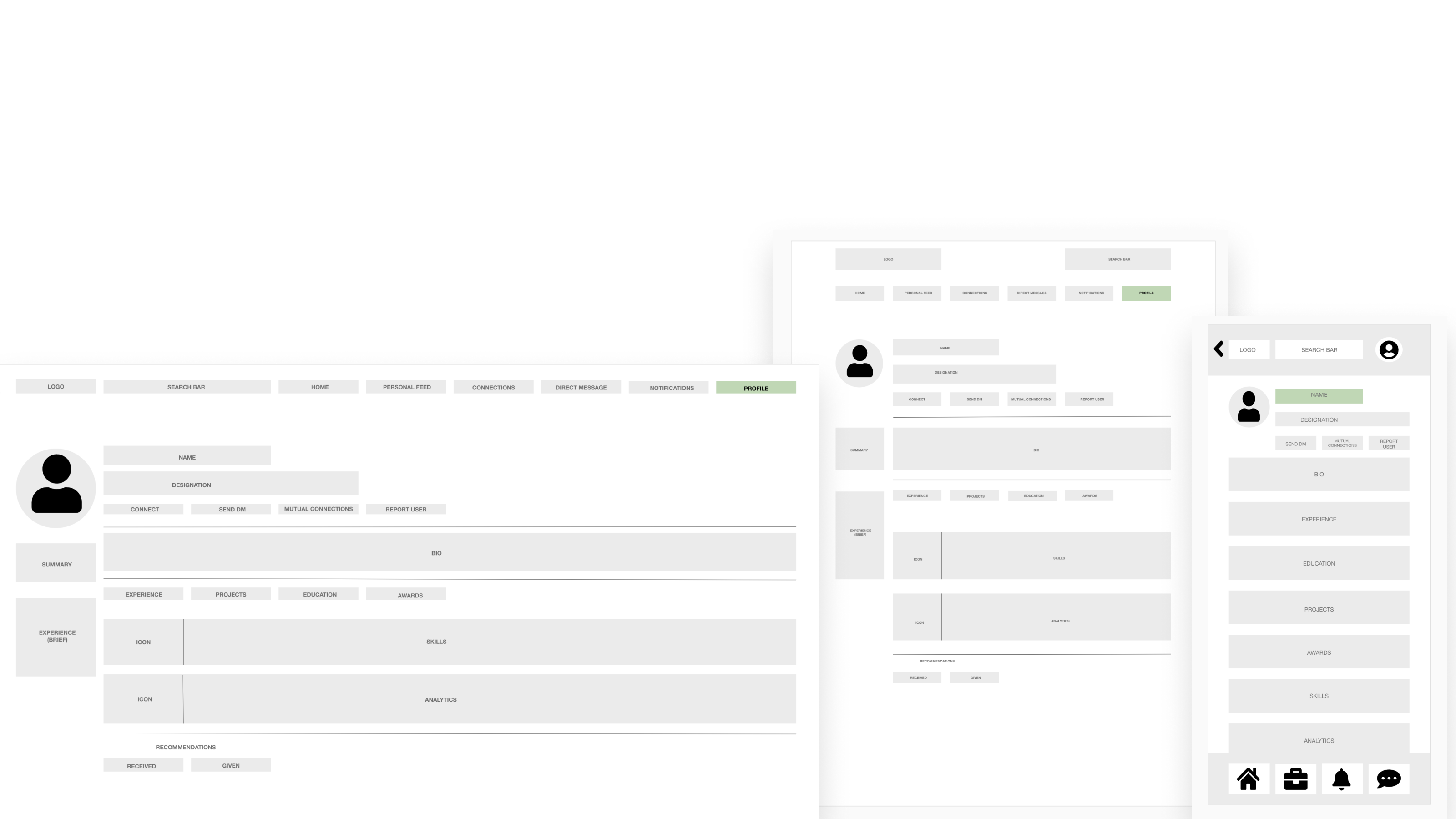
📱

Mobile Experience

Optimized for on-the-go networking and quick portfolio browsing

📱

Tablet Platform

Enhanced interface for detailed portfolio management and networking

💻

Desktop Experience

Full-featured interface with comprehensive profile management

Smart Profile System

Multiple profile views (public/private) with customizable sections that adapt to different professional contexts.

  • • Portfolio-first design
  • • Drag-and-drop customization
  • • Context-aware visibility

Visual Portfolio Hub

Dedicated spaces for designers to showcase their best work with rich media support and project storytelling.

  • • High-resolution image galleries
  • • Project case study integration
  • • Interactive prototypes

Analytics & Insights

Comprehensive analytics showing profile views, engagement metrics, and networking effectiveness.

  • • Profile view tracking
  • • Engagement analytics
  • • Network growth insights

Final Prototype Testing

I conducted final testing with 4 designers from the target market to validate the complete user experience.

Testing Participants

G
Gaurav Jha
K
Kangan
I
Ishita Upadhyay
M
Munish Taya

Testing Results

  • Navigation: Self-explanatory and intuitive layout
  • Icons: Helpful for app navigation (Kangan & Munish)
  • Look & Feel: Visually appealing design (Gaurav)
  • Usability: User-friendly interface (Ishita)

Results & Learnings

Project Outcomes

  • Positive feedback from target users on final prototypes
  • Successfully addressed key pain points identified in research
  • Created a scalable design system for future features
  • Established foundation for designer-focused networking platform

Key Learnings

  • Iterative testing is crucial for validating design decisions
  • Users value simplicity and visual appeal over feature complexity
  • Niche platforms can succeed by deeply understanding user needs
  • Branding decisions should be data-driven, not assumption-based

"The final version of Candid Connections received positive reviews from the target market."

This project demonstrated the importance of user-centered design and iterative testing in creating solutions that truly address user needs. The comprehensive research and testing process resulted in a platform that successfully differentiates itself from existing networking sites through its focus on designers' unique requirements.

Next Steps

Ready to explore more of my design work?